Plotly
plotly可视化笔记
简介:
plotly是python下的开源图形库。
使用:
有两种调用方式,一种用plotly.express,另一种是plotly.graph_objects。两者区别是plotly.express方便,但是有些配置还不支持,比如子图的设置,还是要用到plotly.graph_objects。
两者的区别详见:Graph Objects。
plotly.express简单图形:
折线图:
import plotly.express as px

df = px.data.gapminder().query("continent=='Oceania'")
fig = px.line(df, x="year", y="lifeExp", color='country')
fig.show()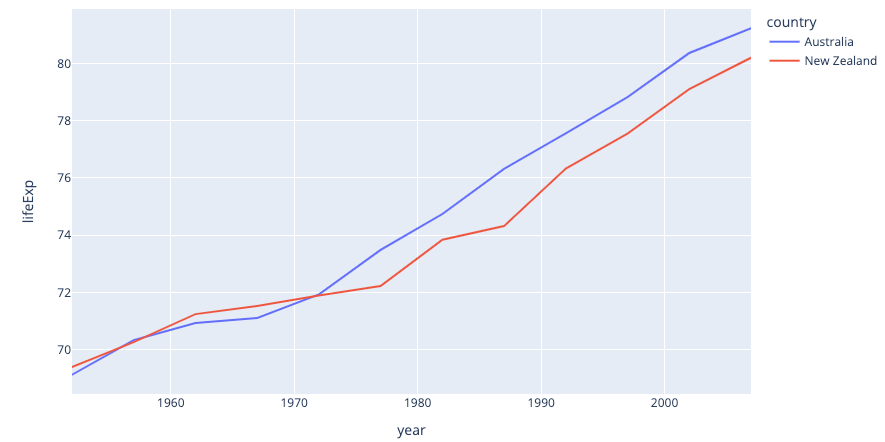
plotly.graph_objects简单图形:
散点图:
import plotly.graph_objects as go

fig = go.Figure(
    data=go.Scatter(x=[1, 2, 3, 4],
                    y=[10, 11, 12, 13],
                    mode='markers',
                    marker=dict(size=[40, 60, 80, 100], color=[0, 1, 2, 3])))

fig.show()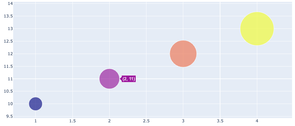
子图:
plotly.graph_objects
from plotly.subplots import make_subplots
import plotly.graph_objects as go

fig = make_subplots(rows=3, cols=1)

fig.append_trace(go.Scatter(
    x=[3, 4, 5],
    y=[1000, 1100, 1200],
), row=1, col=1)

fig.append_trace(go.Scatter(
    x=[2, 3, 4],
    y=[100, 110, 120],
), row=2, col=1)

fig.append_trace(go.Scatter(x=[0, 1, 2], y=[10, 11, 12]), row=3, col=1)

fig.update_layout(height=600, width=600, title_text="Stacked Subplots")
fig.show()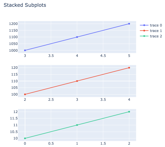
plotly.express
import plotly.express as px
import plotly.subplots as sp

data_canada = px.data.gapminder().query("country == 'Canada'")

figures = []
fig1 = px.bar(data_canada, x='year', y='pop')
fig2 = px.bar(data_canada, x='year', y='pop')
fig3 = px.bar(data_canada, x='year', y='pop')

figures.append(fig1)
figures.append(fig2)
figures.append(fig3)

figure_traceses = []
for n, f in enumerate(figures):
    fts = []
    for trace in range(len(f["data"])):
        fts.append(f["data"][trace])
    figure_traceses.append(fts)

# Create a 1x2 subplot
this_figure = sp.make_subplots(rows=len(figures),
                               cols=1,
                               subplot_titles=['1图', '2图', '3图'])
this_figure.update_layout(height=600,
                          width=600,
                          title_text="Test Title",
                          title_font_size=25)

# Get the Express fig broken down as traces and add the traces to the proper plot within the subplot
for n, ft in enumerate(figure_traceses):
    for traces in ft:
        this_figure.add_trace(traces, row=1 + n, col=1)

this_figure.show()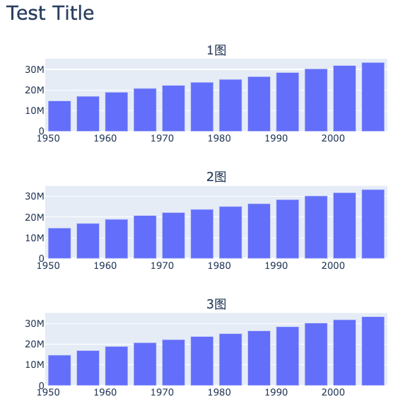
详细配置:
x轴日期格式化
fig.update_layout(xaxis=dict(tickformat="%y-%m-%d"))使用高德地图:
import plotly.graph_objects as go

data = []

# scattermapbox = go.Scattermapbox()
my_map = go.Scattermapbox(
    lat=df['latitude'],
    lon=df['longitude'],
    mode='markers',
    marker=go.scattermapbox.Marker(size=14),
    #     text=['Montreal'],
    text=df['name'],
)
data.append(my_map)

basemap_layer = [
    dict(
        below="traces",
        sourcetype="raster",
        sourceattribution="高德地图",
        source=[
            "http://wprd01.is.autonavi.com/appmaptile?x={x}&y={y}&z={z}&lang=zh_cn&size=1&scl=1&style=7"
        ])
]

mapbox_kargs = dict(
    zoom=10,
    center=dict(
        lat=30.272934,
        lon=120.147376,
    ),
    style="white-bg",
    layers=basemap_layer,
)

layout_kargs = dict(
    autosize=False,
    width=1000,
    height=500,
    margin=dict(r=0, t=38, l=0, b=0, pad=0),
)

layout = go.Layout(mapbox=mapbox_kargs, **layout_kargs)

fig = go.Figure(data=data, layout=layout)

fig.show()